Oxford Eye Hospital — Waiting Areas and Wayfinding Improvement Project
I was asked to review the clinical areas at Oxford Eye Hospital and evaluate what improvements could be made to better support both patients and staff.
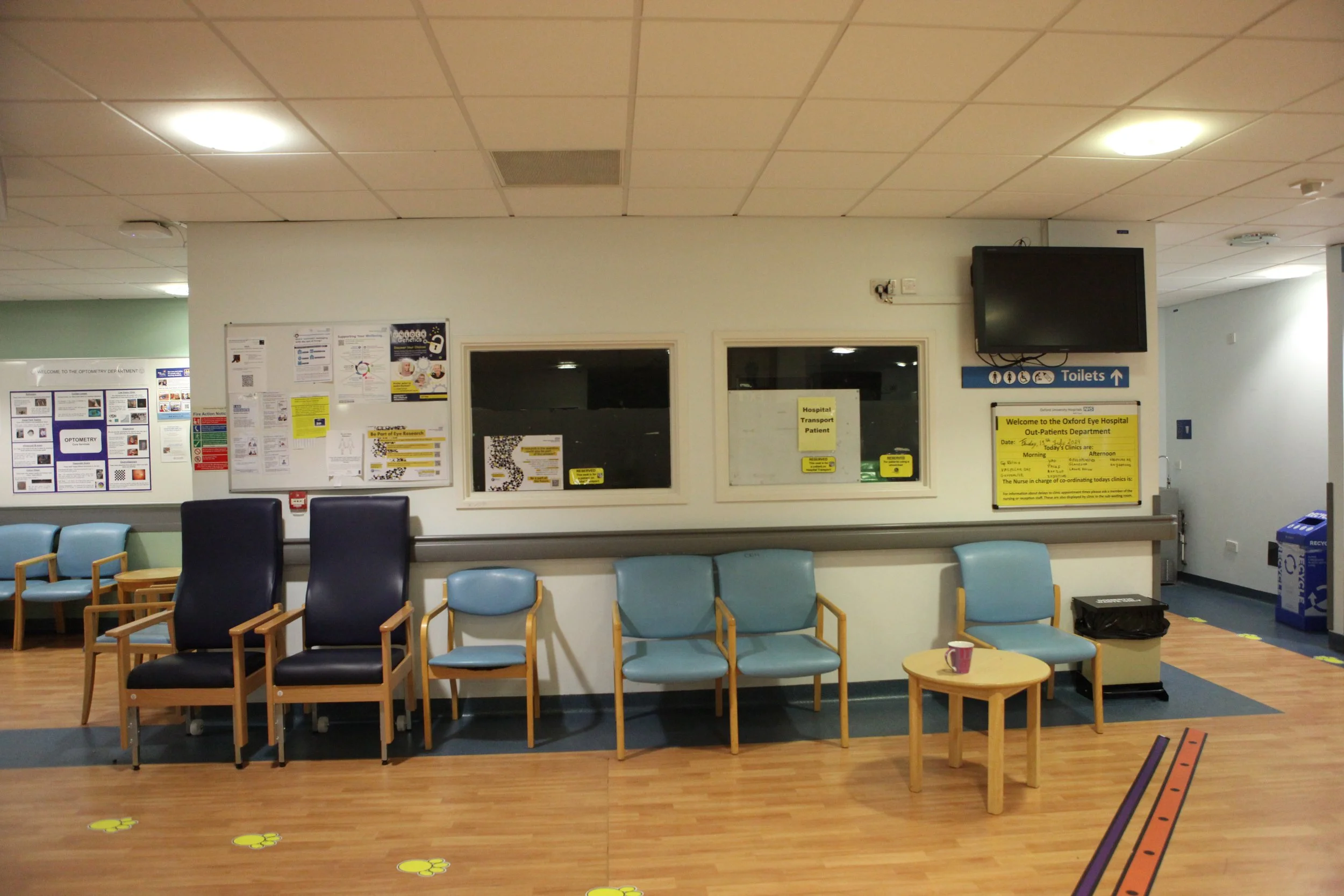
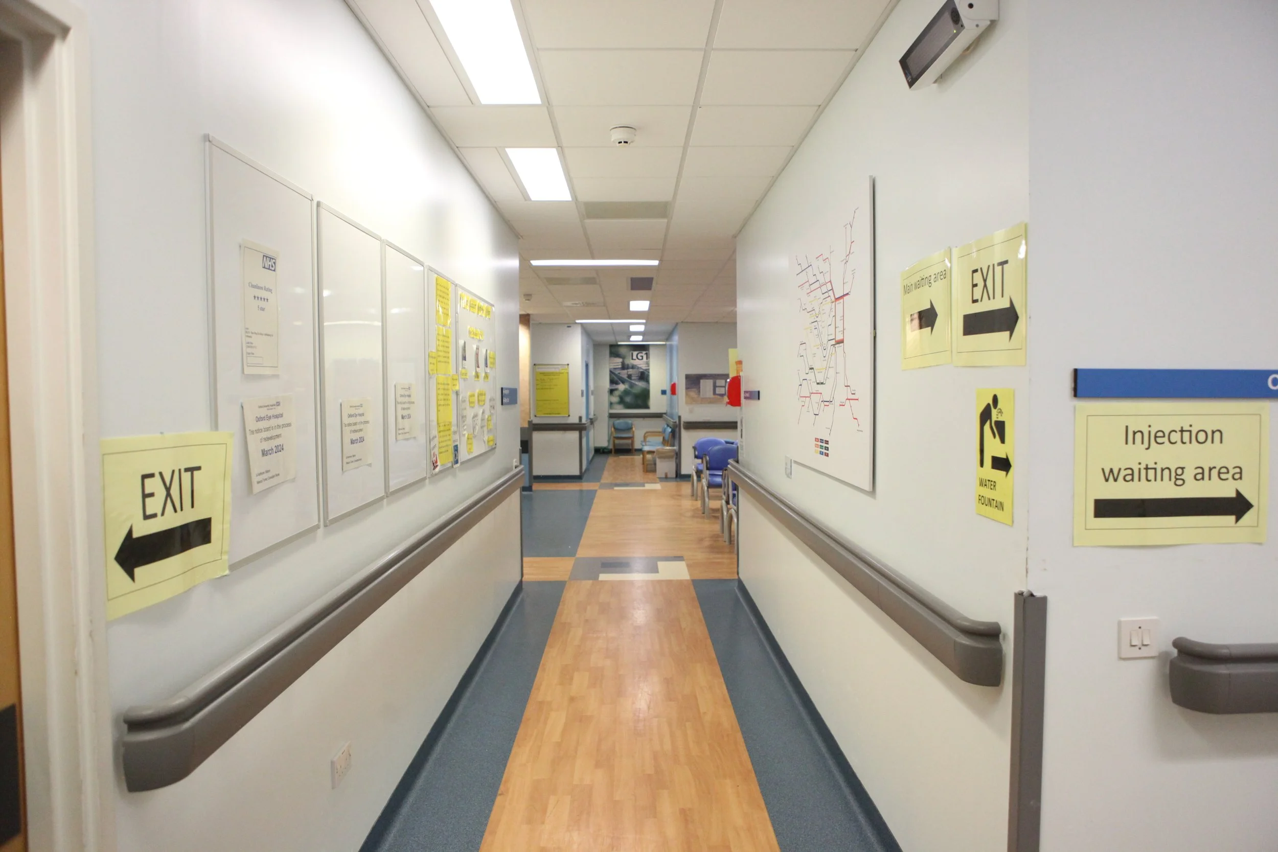
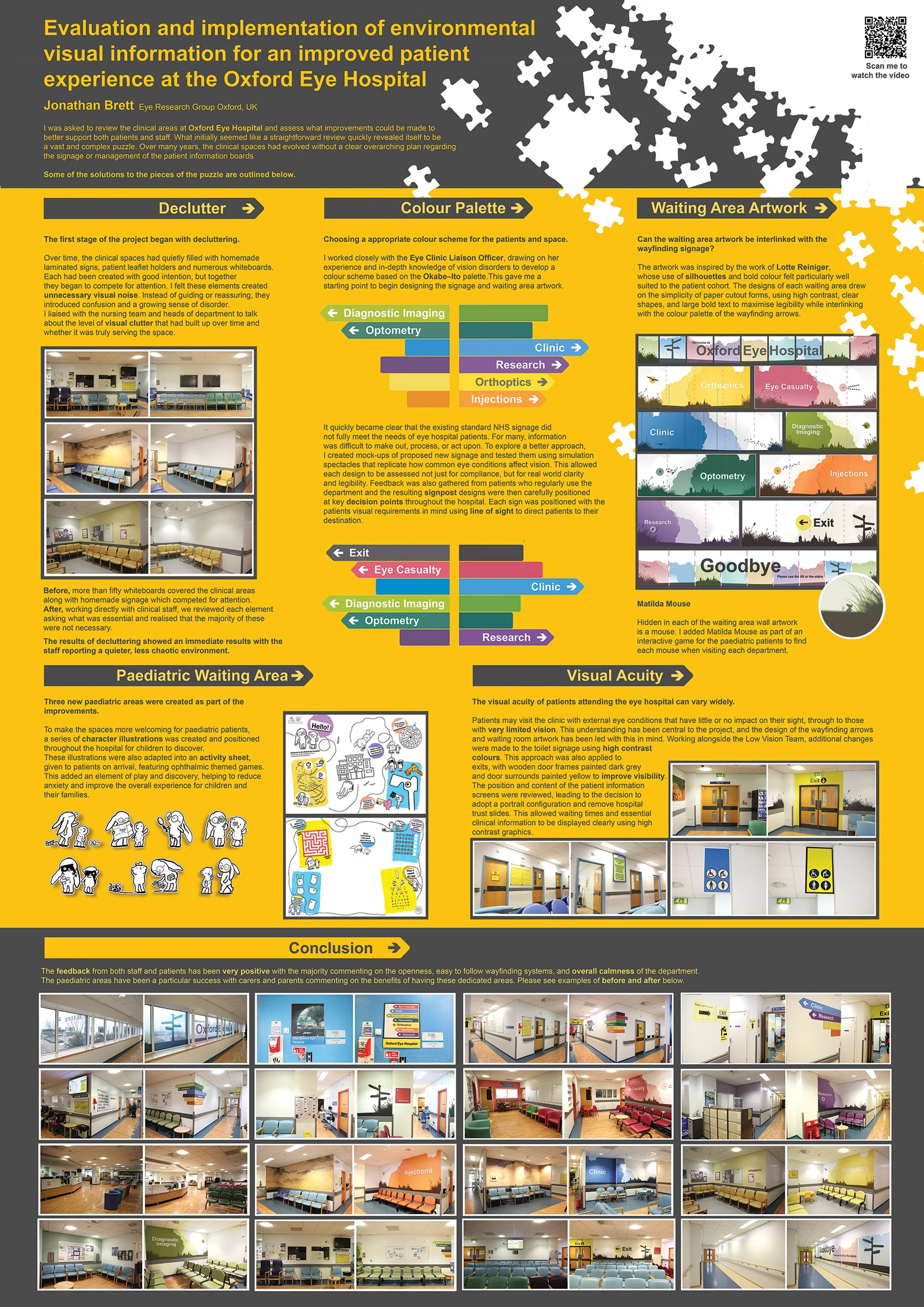
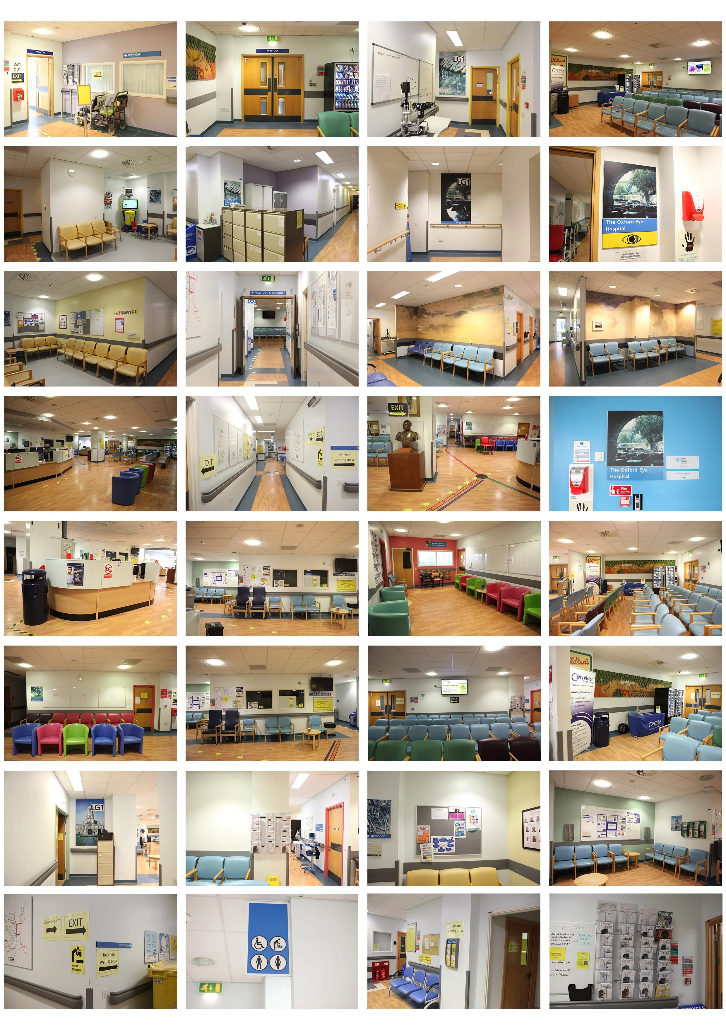
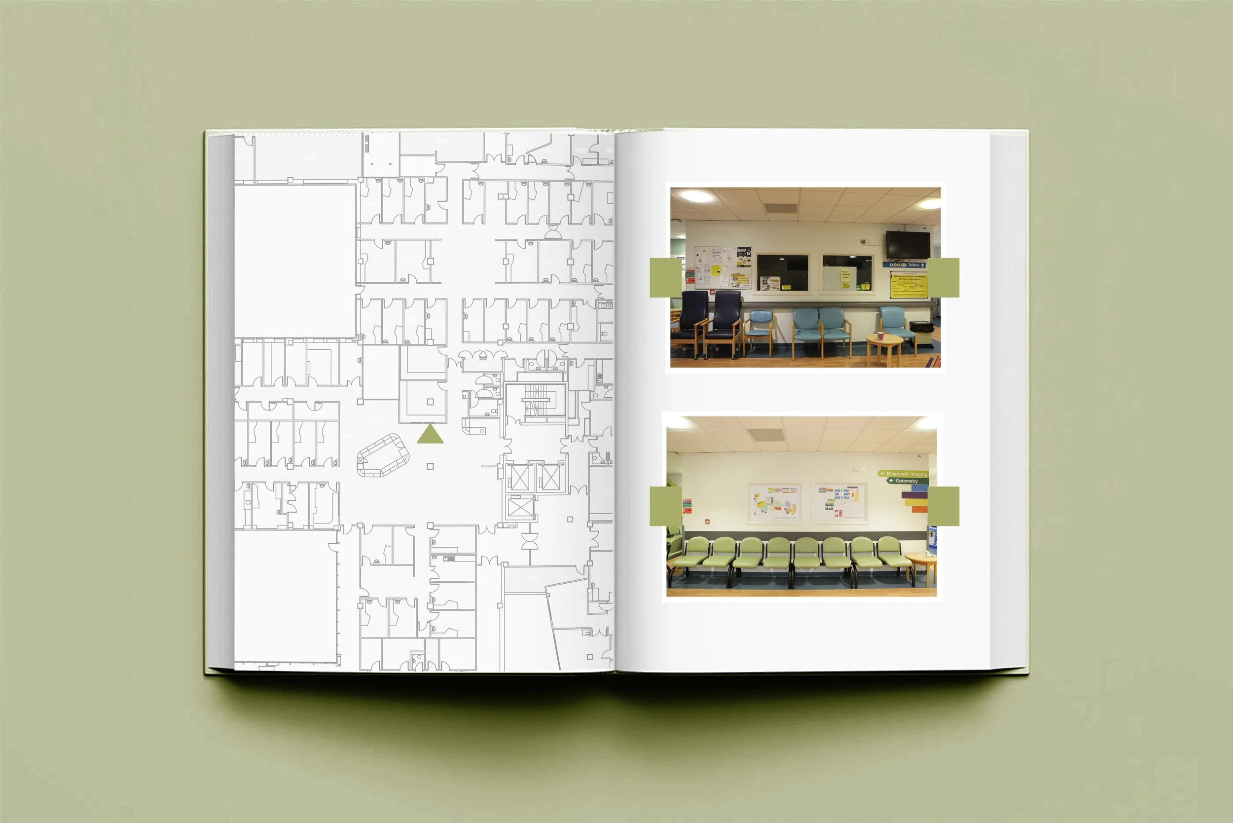
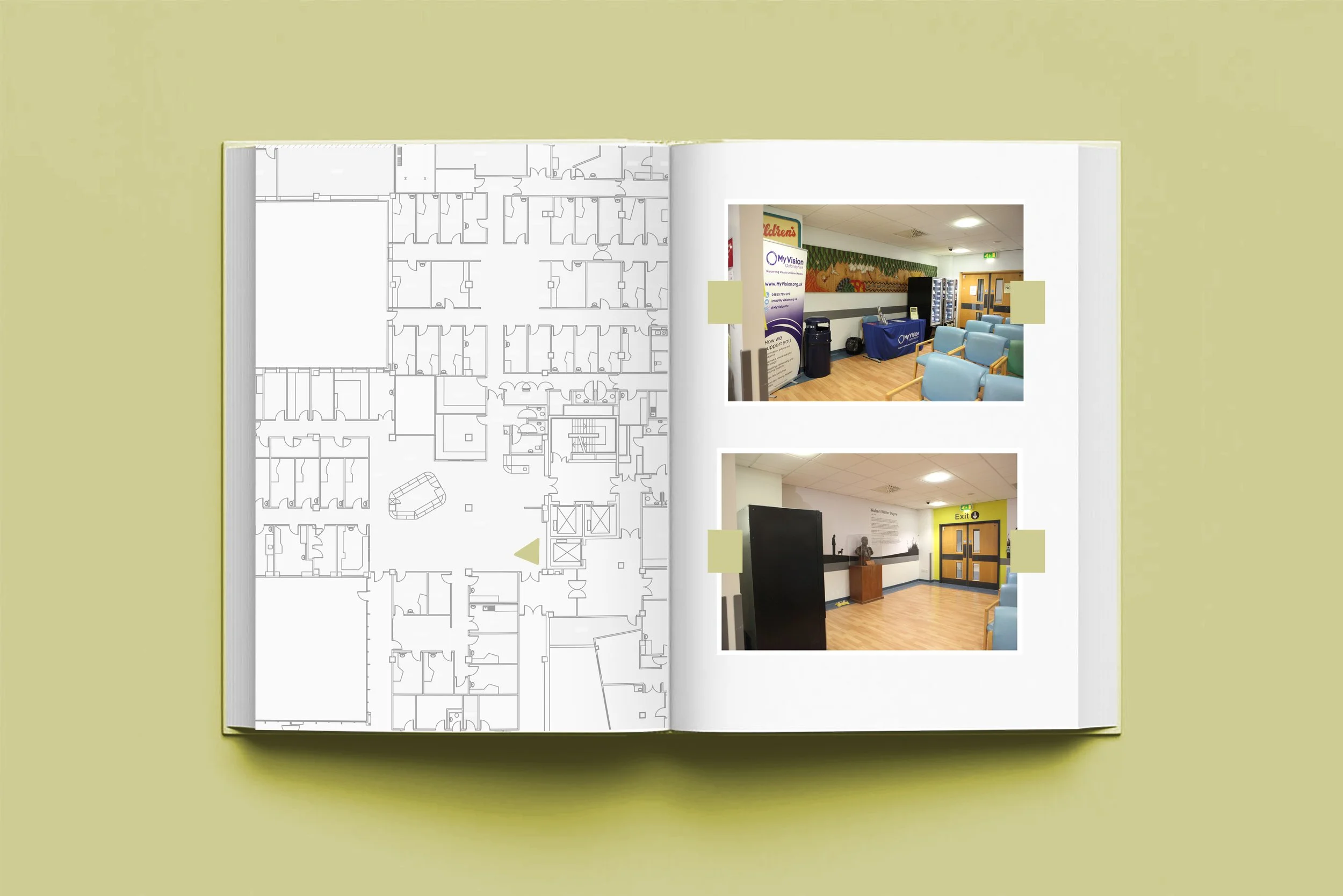
The first stage of the project focused on decluttering. Over time the spaces had accumulated homemade laminated signs (standard NHS signage was too small for our visually impaired patients), empty patient leaflet holders, and a large number of whiteboards (most of these a showed out of date information).
I felt these elements contributed to unnecessary visual noise which caused confusion and a sense of disorder. I liaised with the nursing team and heads of departments to discuss removing some of this visual clutter and was given the green light to make any changes. I met with the nursing team to discuss which whiteboards could go and out of the 50+ that were in place we managed to reduce this down to 8. This also applied to patient leaflet holders. Using a floor plan supplied by the trusts estates team I mapped out where these should be positioned and met with each department to ensure total transparency regarding any changes. We were very fortunate that the buildings paint lifecycle was due so any charges for painting or making good would be picked up by the building owners (PFI).
The plan was to remove all non-essential items, creating a more open, calmer environment.
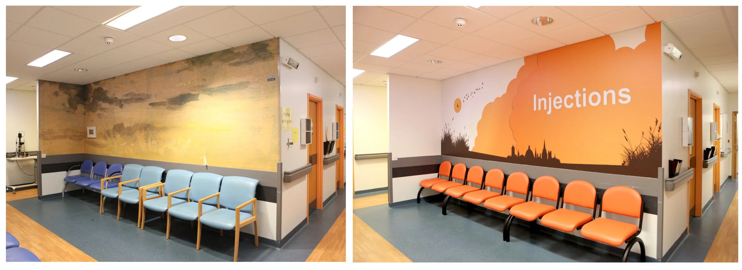
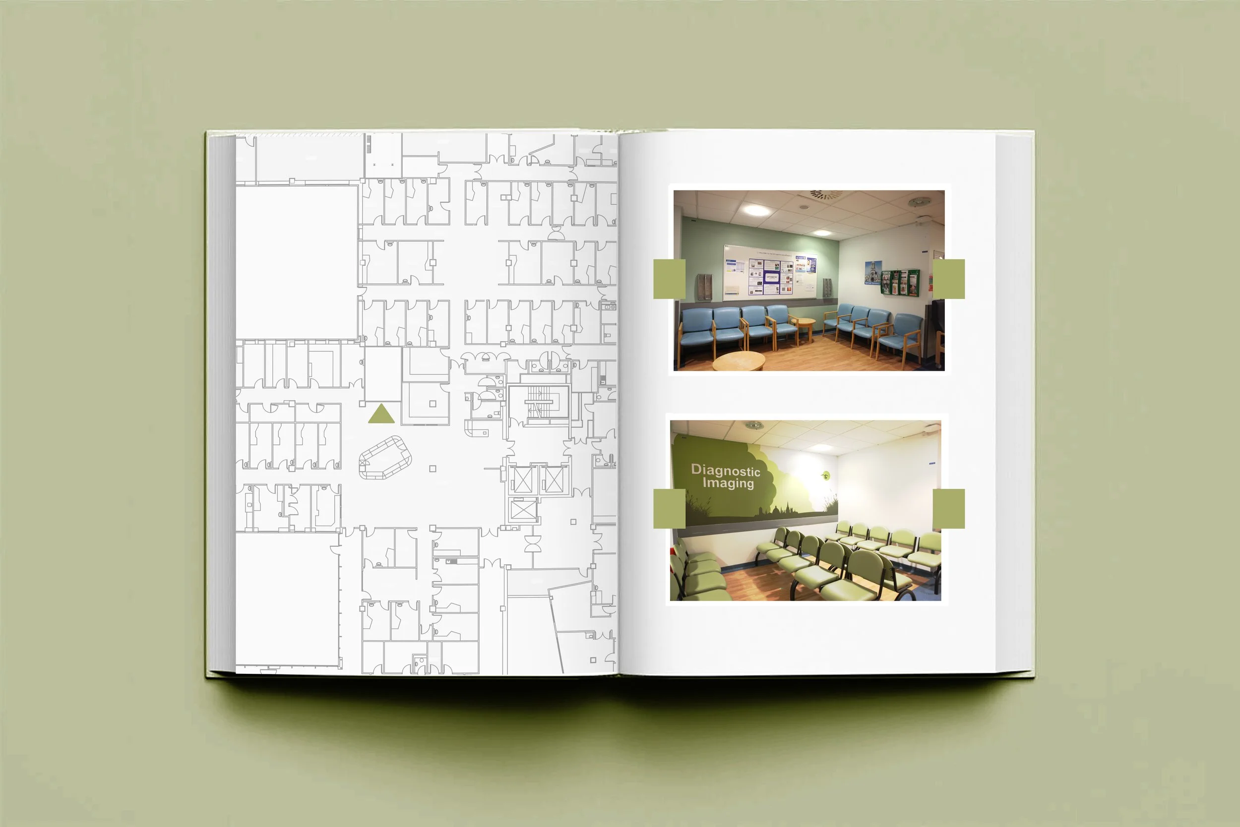
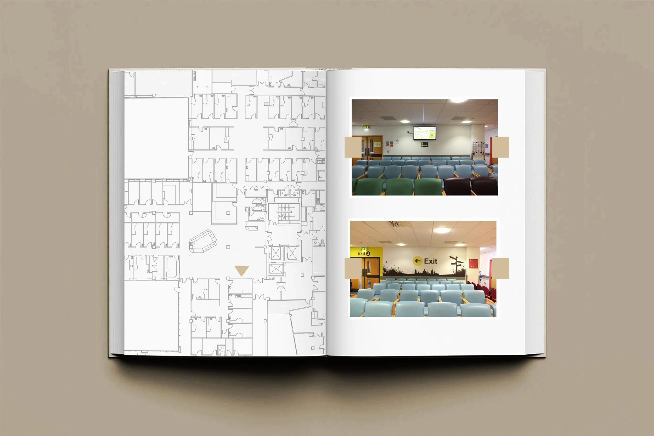
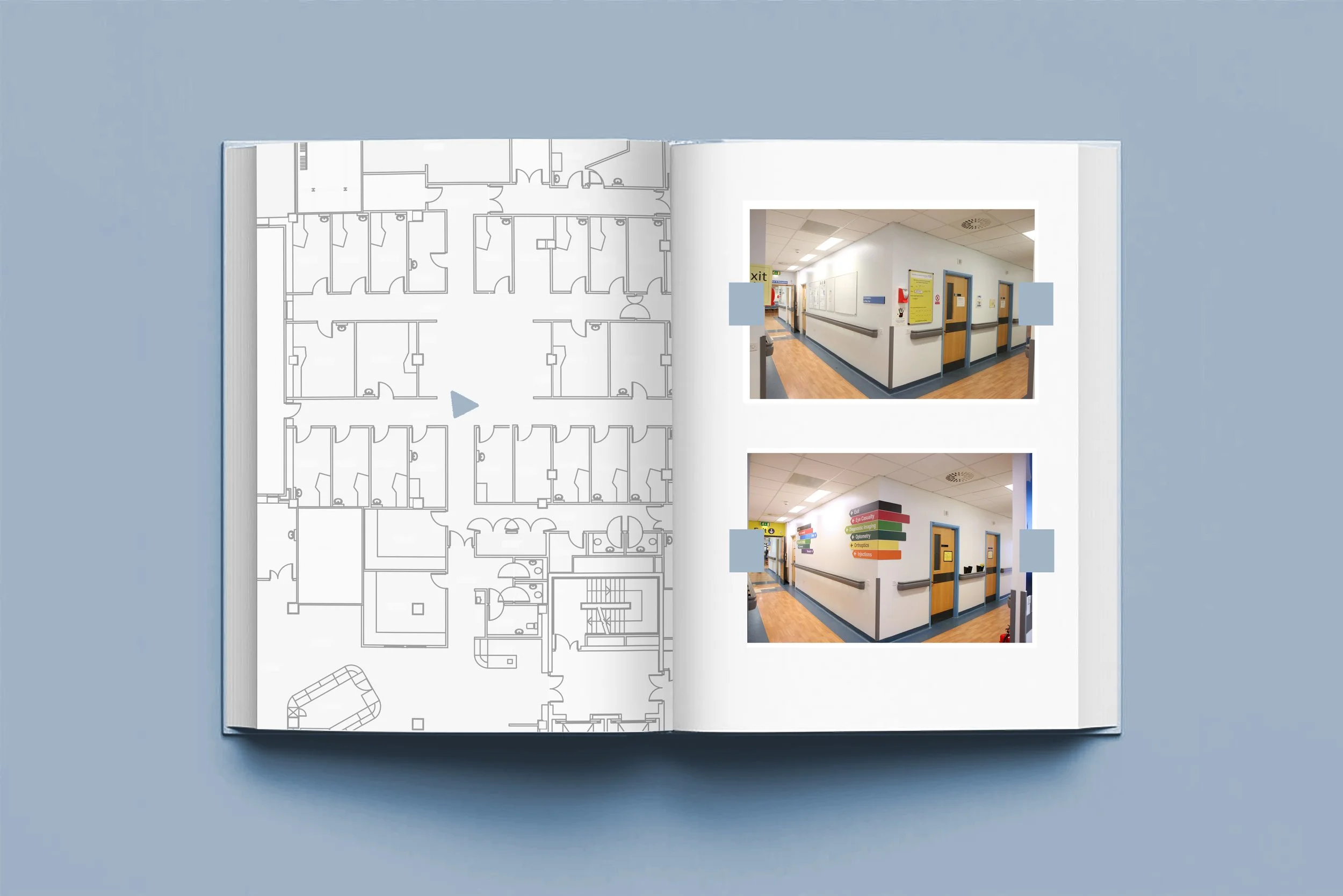
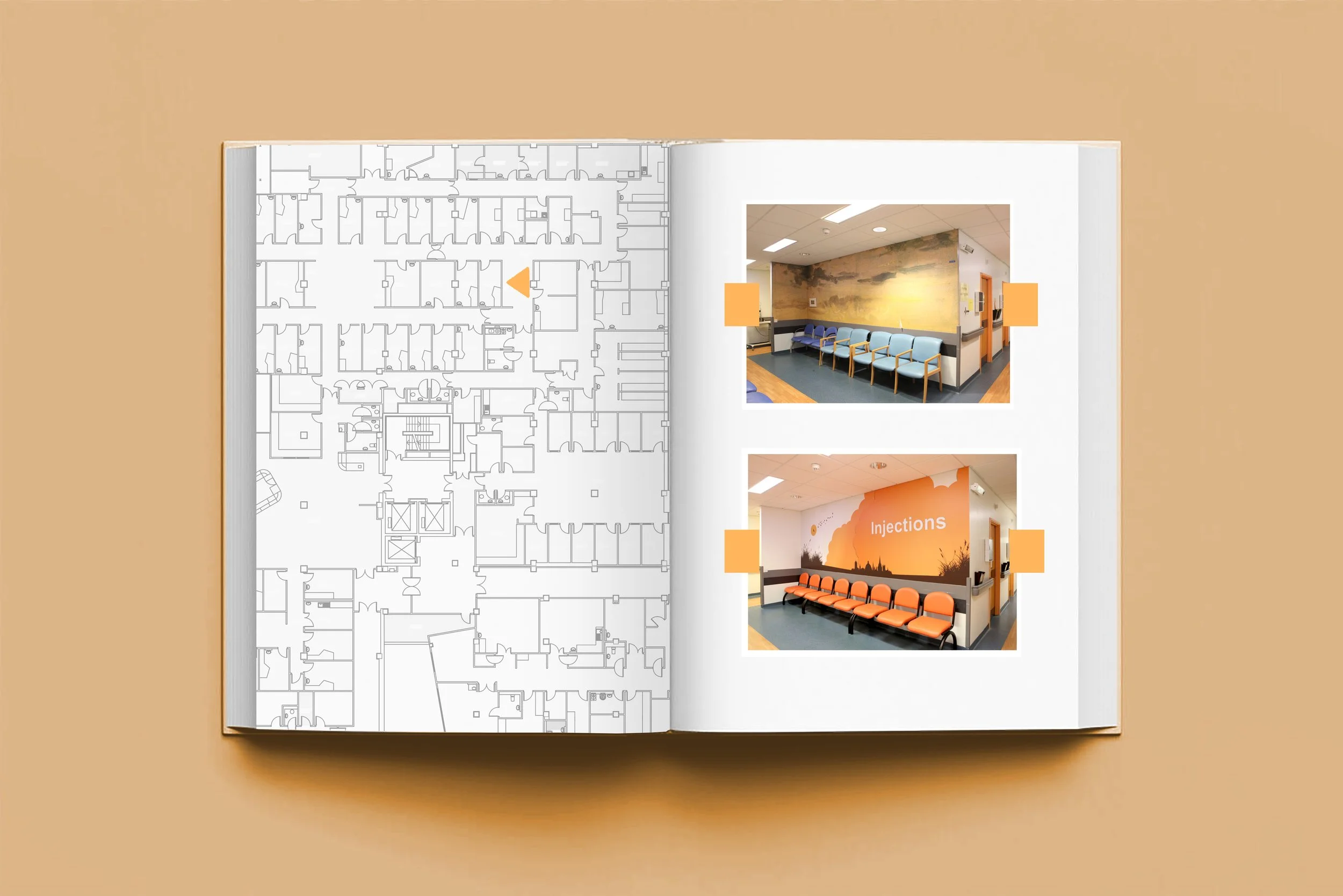
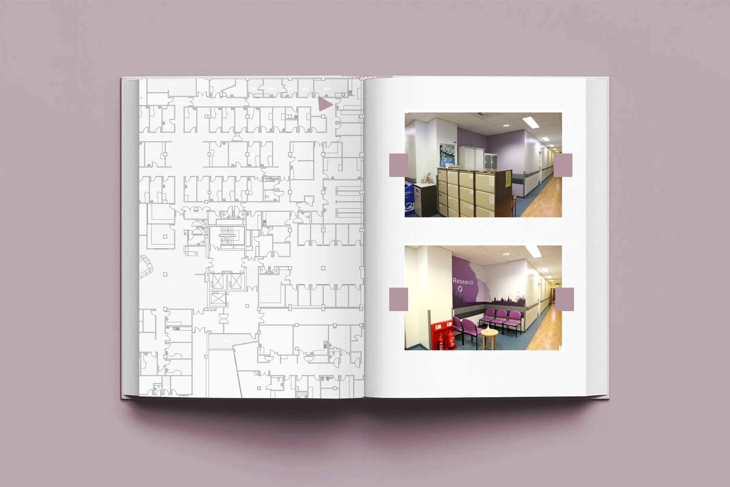
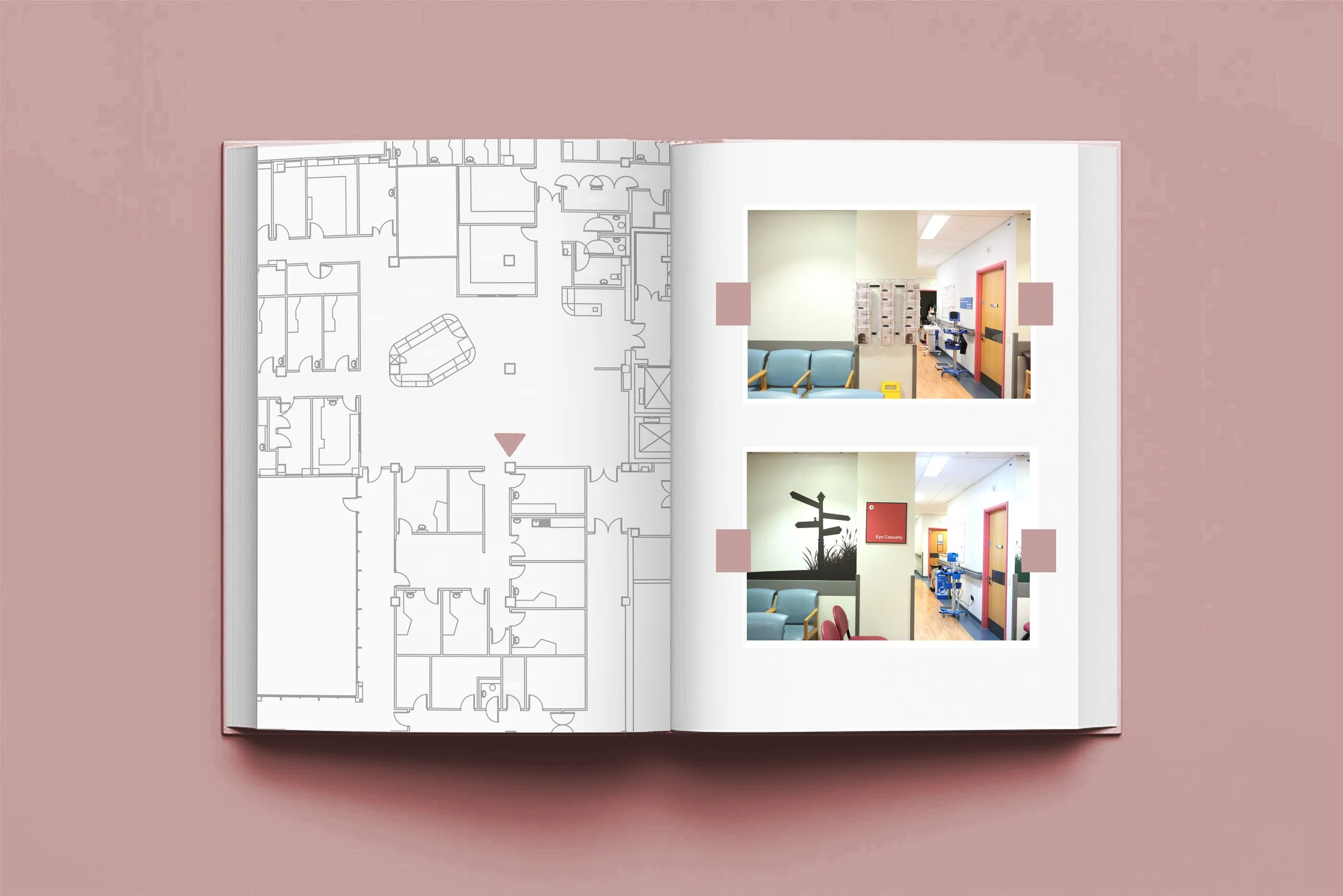
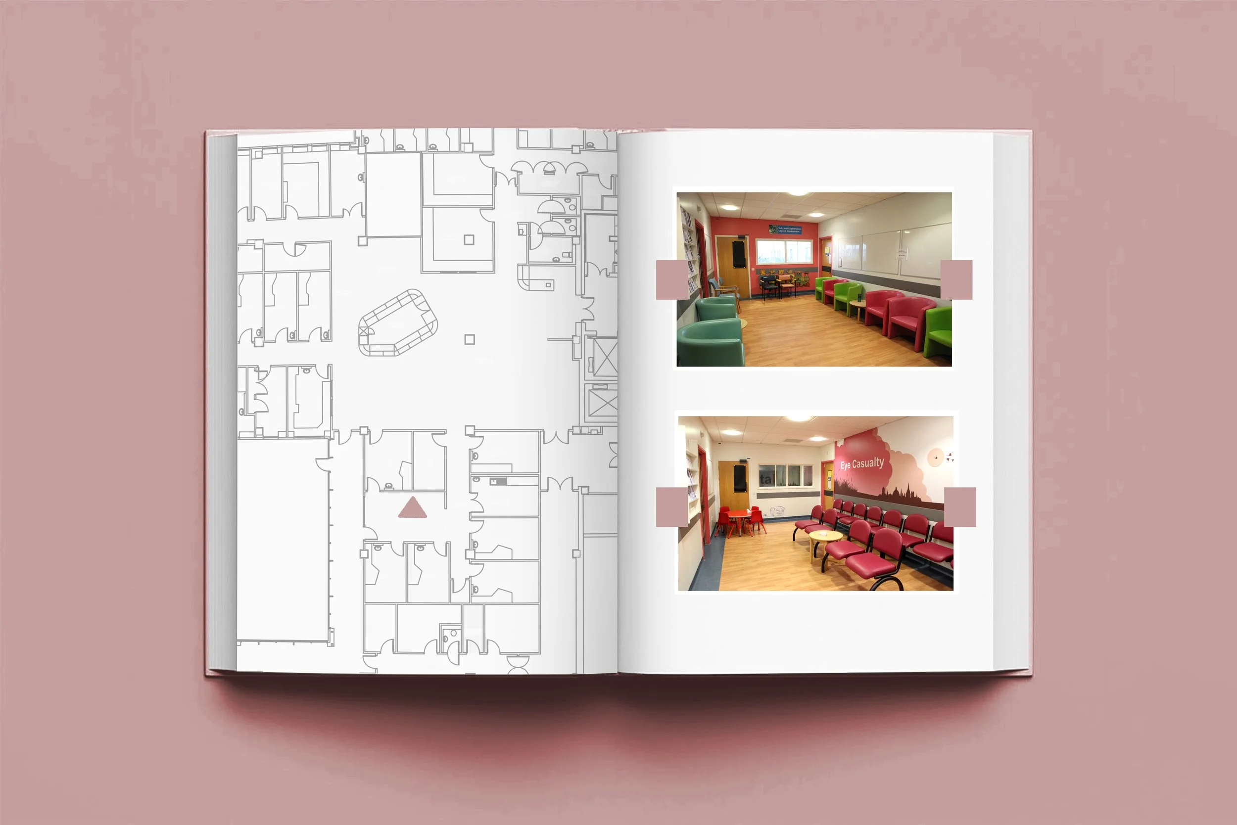
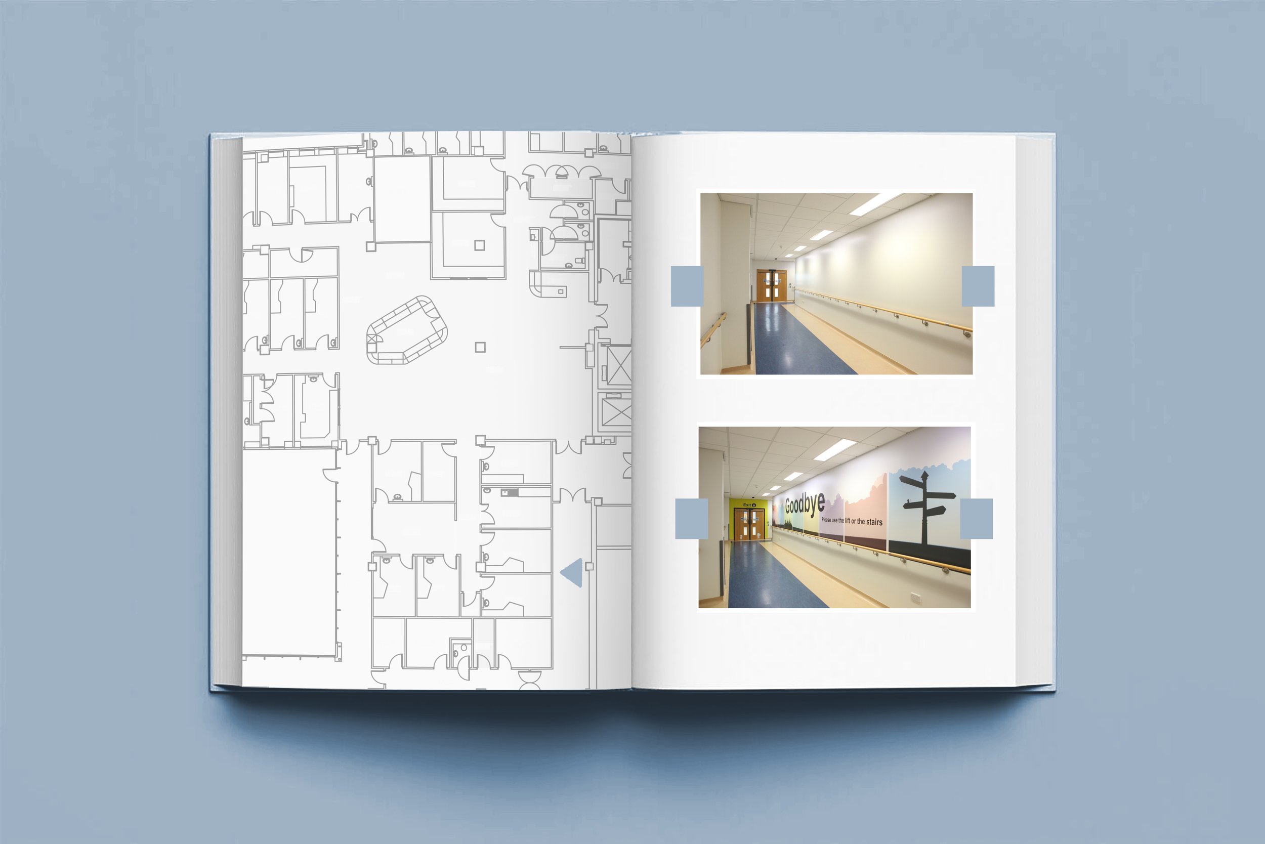
When the eye hospital moved into the new department in 2007 a colour scheme was in place and over the years this had been long forgotten. Door framed and waiting areas were painted in 6 colours as part of the original wayfinding system.
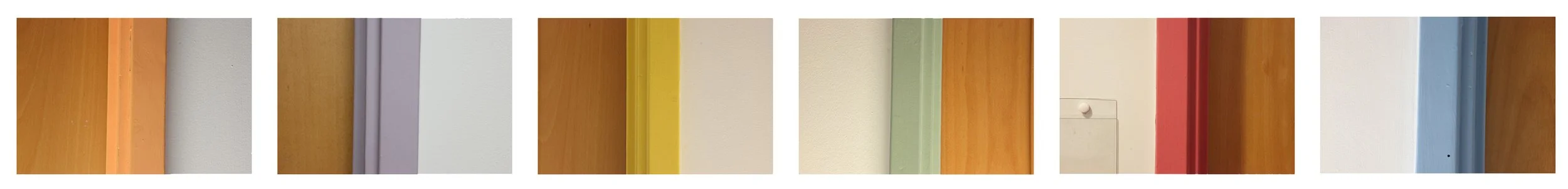
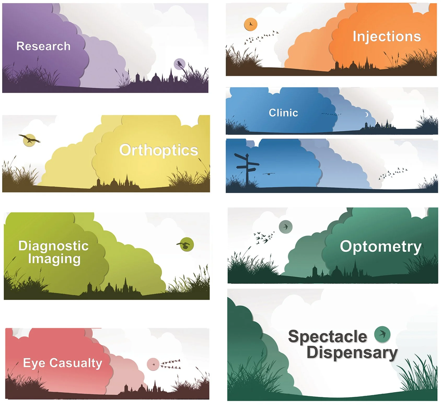
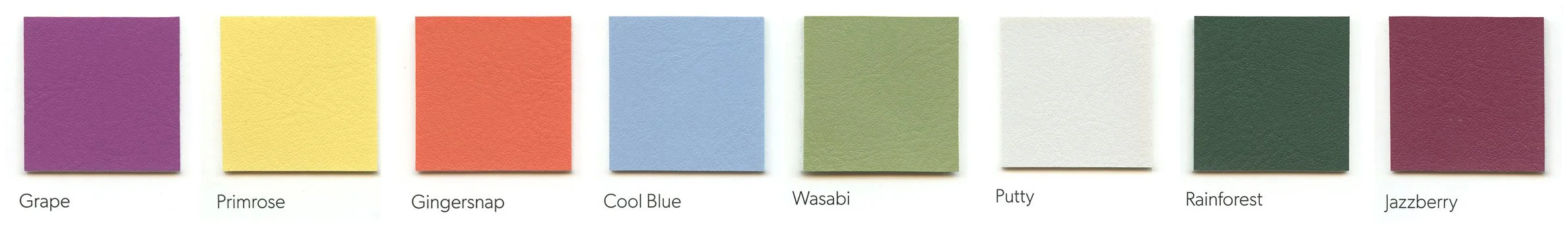
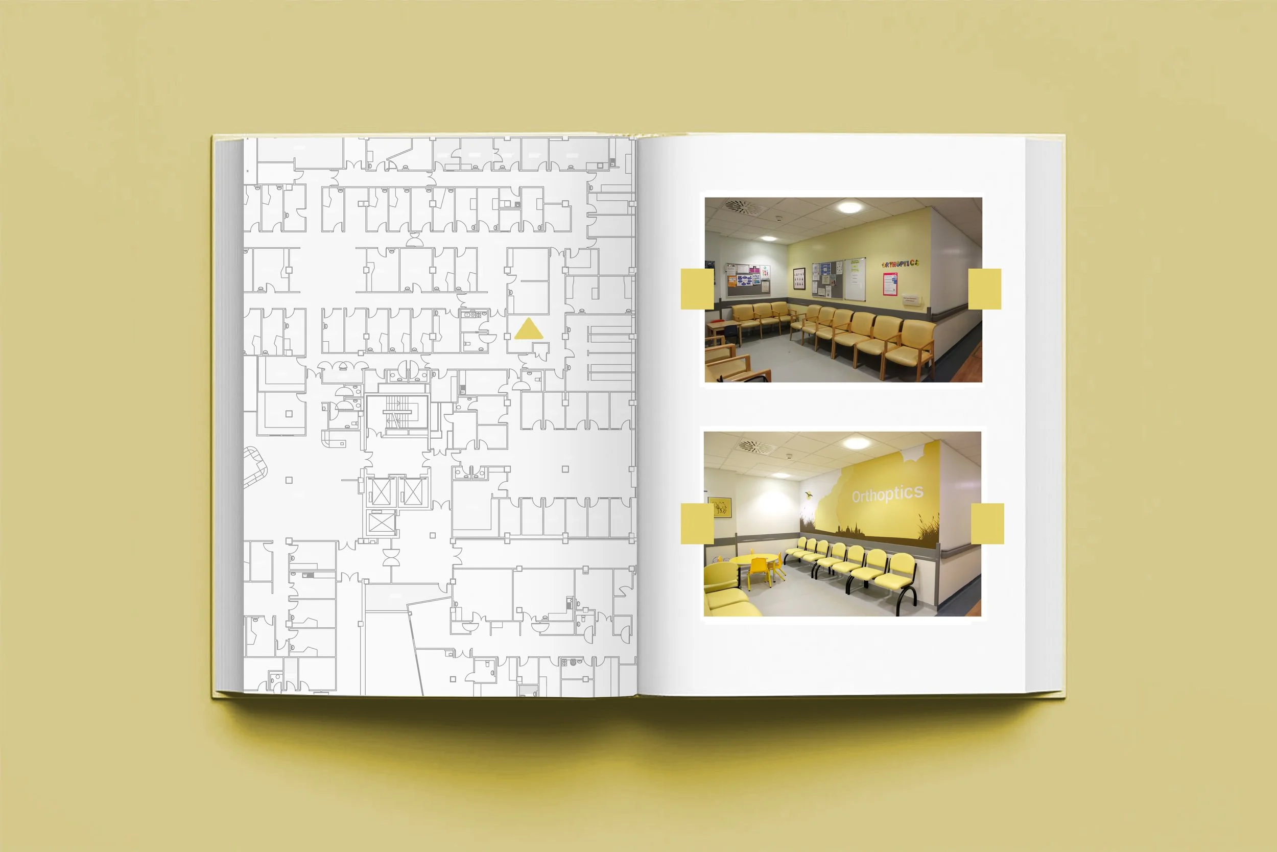
Building on the hospital’s existing colour scheme (most of the staff were unaware behind the reason of the coloured door frames), I wanted to reintroduce the colour coding and started with creating large format artwork for each waiting area. I worked closely with Jean Dash (Eye Clinic Liaison Officer) and used her experience and knowledge of vision disorders to create a a colour scheme based on the Okabe-Ito colour scheme which also complemented the existing coloured doorframes.
The artwork was inspired by the work of Lotte Reiniger, whose use of silhouettes and bold colour felt particularly well suited to the patient cohort and space. The designs of each waiting area drew on the simplicity of paper cut‑out forms, using high contrast and clear shapes to maximise legibility while fitting in with the hospital’s existing colour scheme.
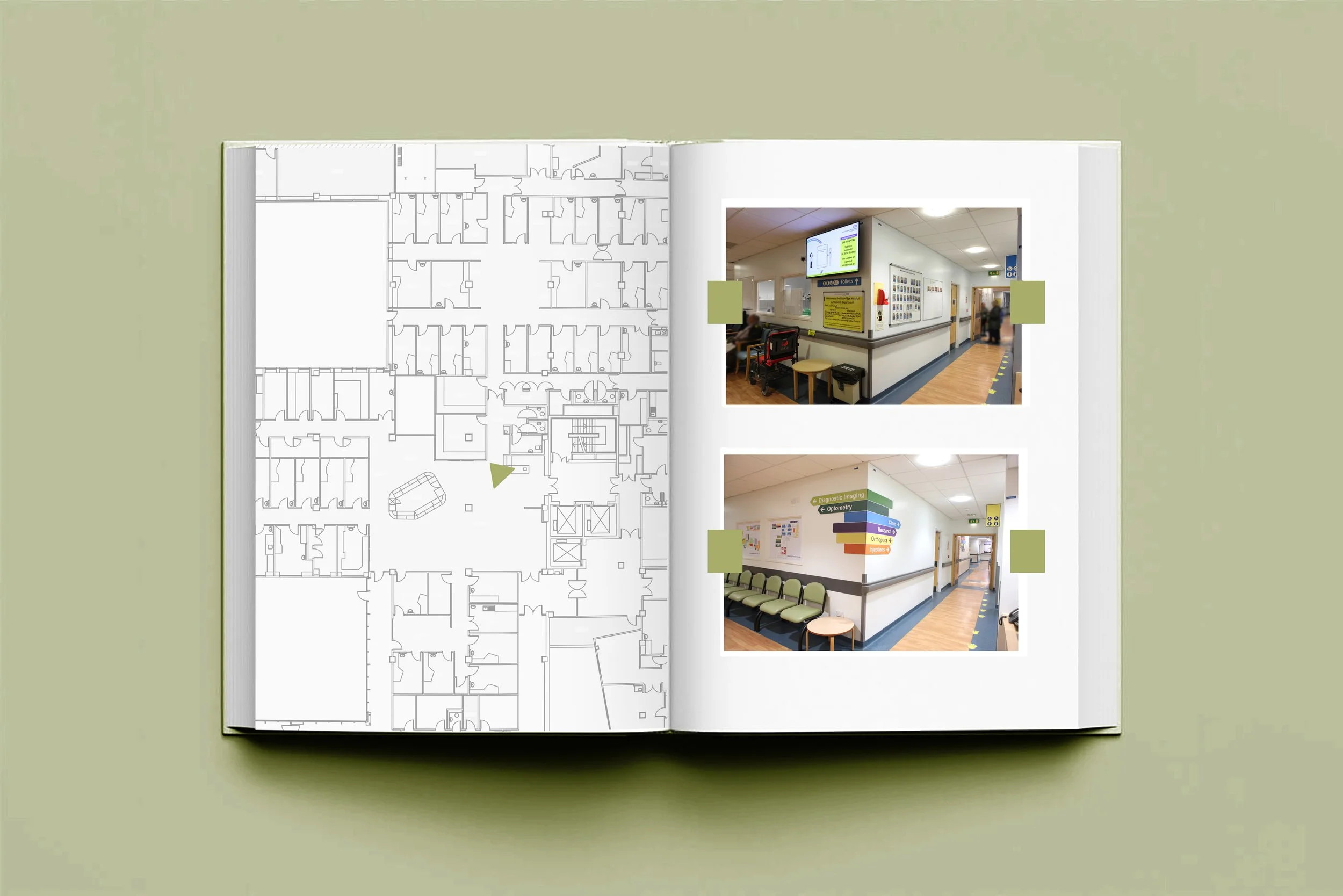
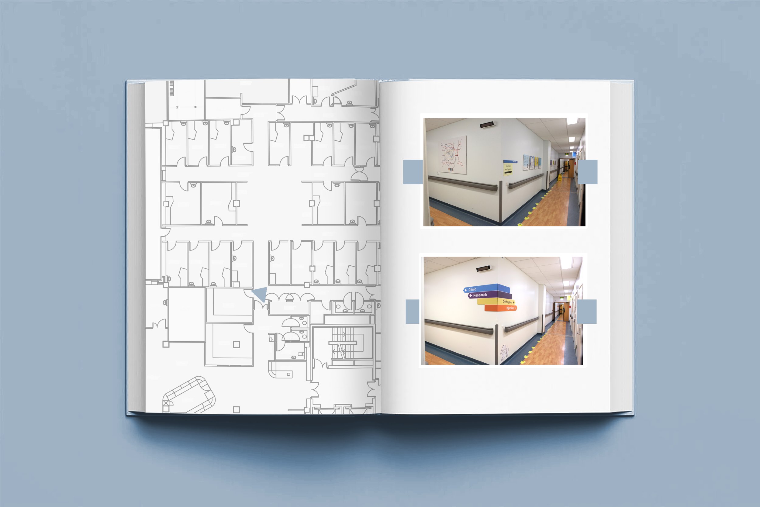
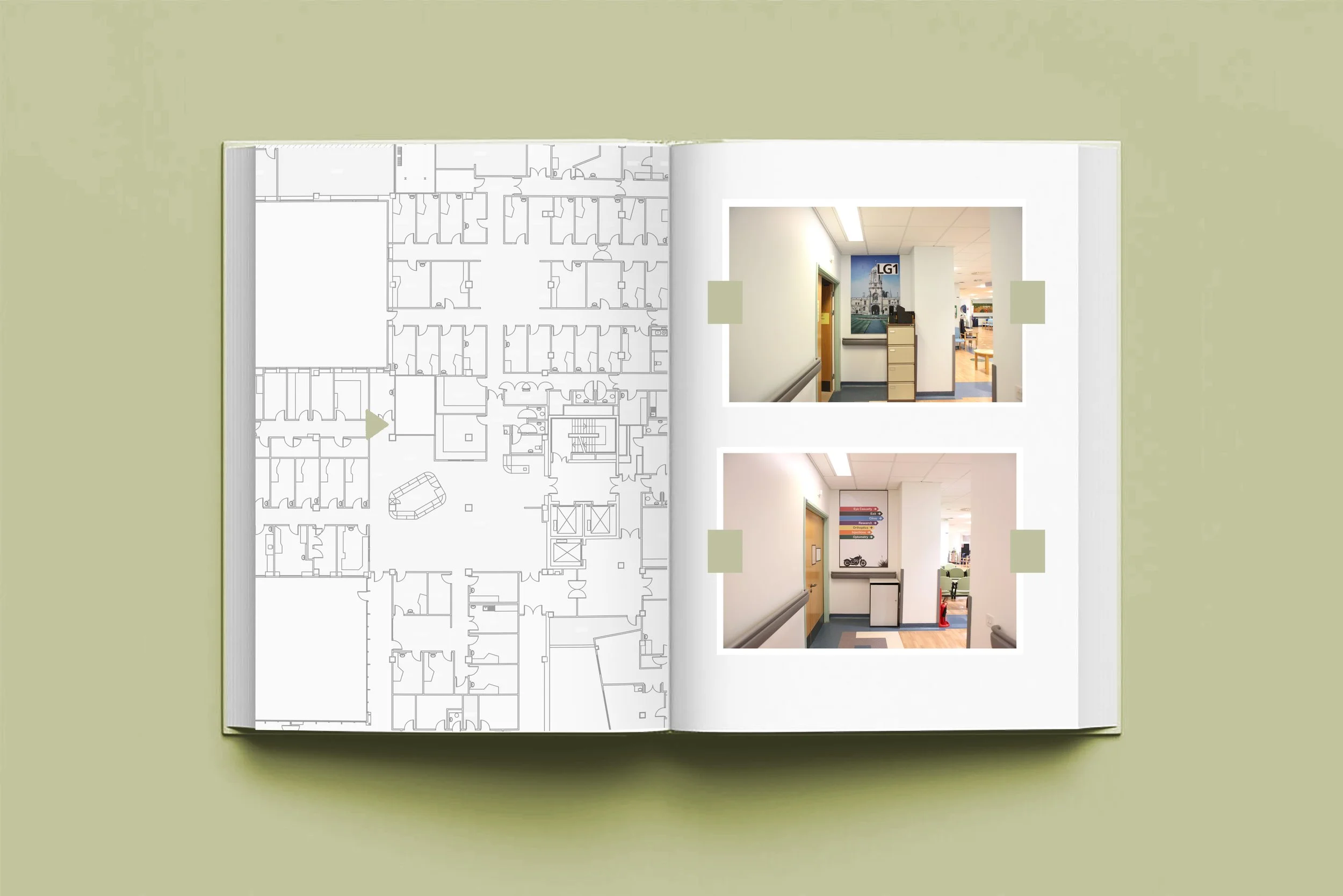
This colour palette was also used in the new signage. I made various mock ups using the departments photocopier (lots of A4 sheets stuck together) to select a suitable size. Simulation glasses which give the wearer an idea of different eye conditions were also used and proved to be very useful in establishing the correct signage height and size. I placed small A4 photocopies around the hospital and walked around the department following each arrow to make sure they were correctly positioned.
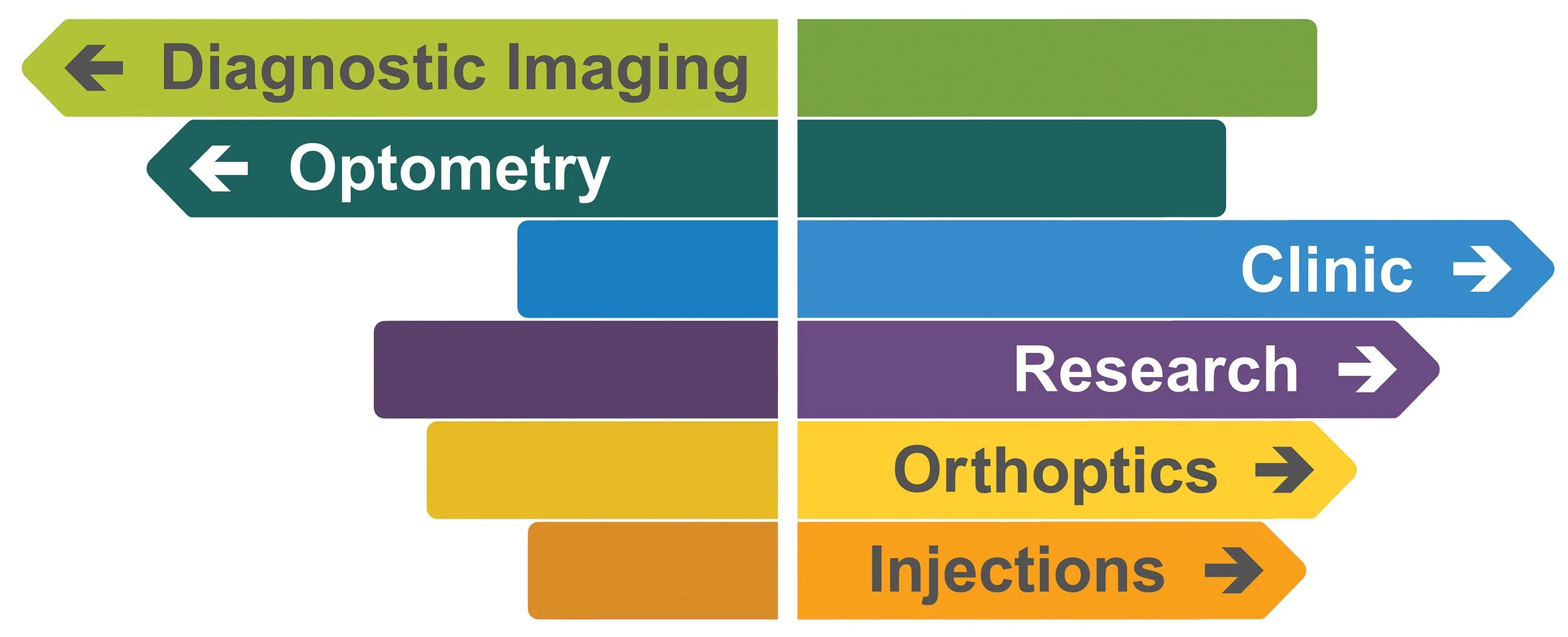
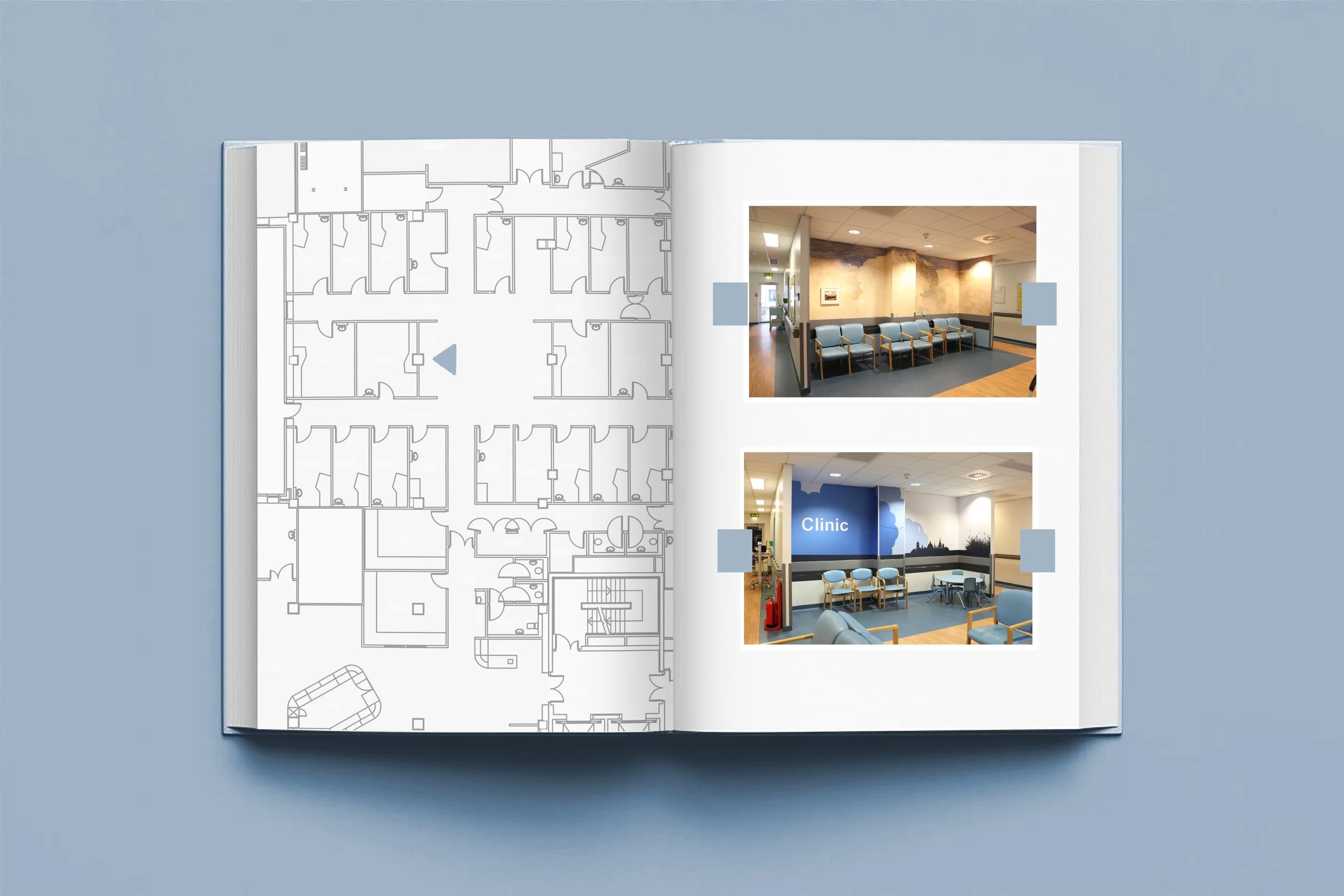
New colour‑coordinated seating was introduced and the colours of the seating was carefully considered. These colours were chosen to compliment the colour scheme that I used in the waiting area artwork and signage. The idea was to ask the patients to follow the coloured arrow (let’s say orange for example) to the orange waiting area and take a seat on the orange chairs. Simple idea but in theory it should be very effective.
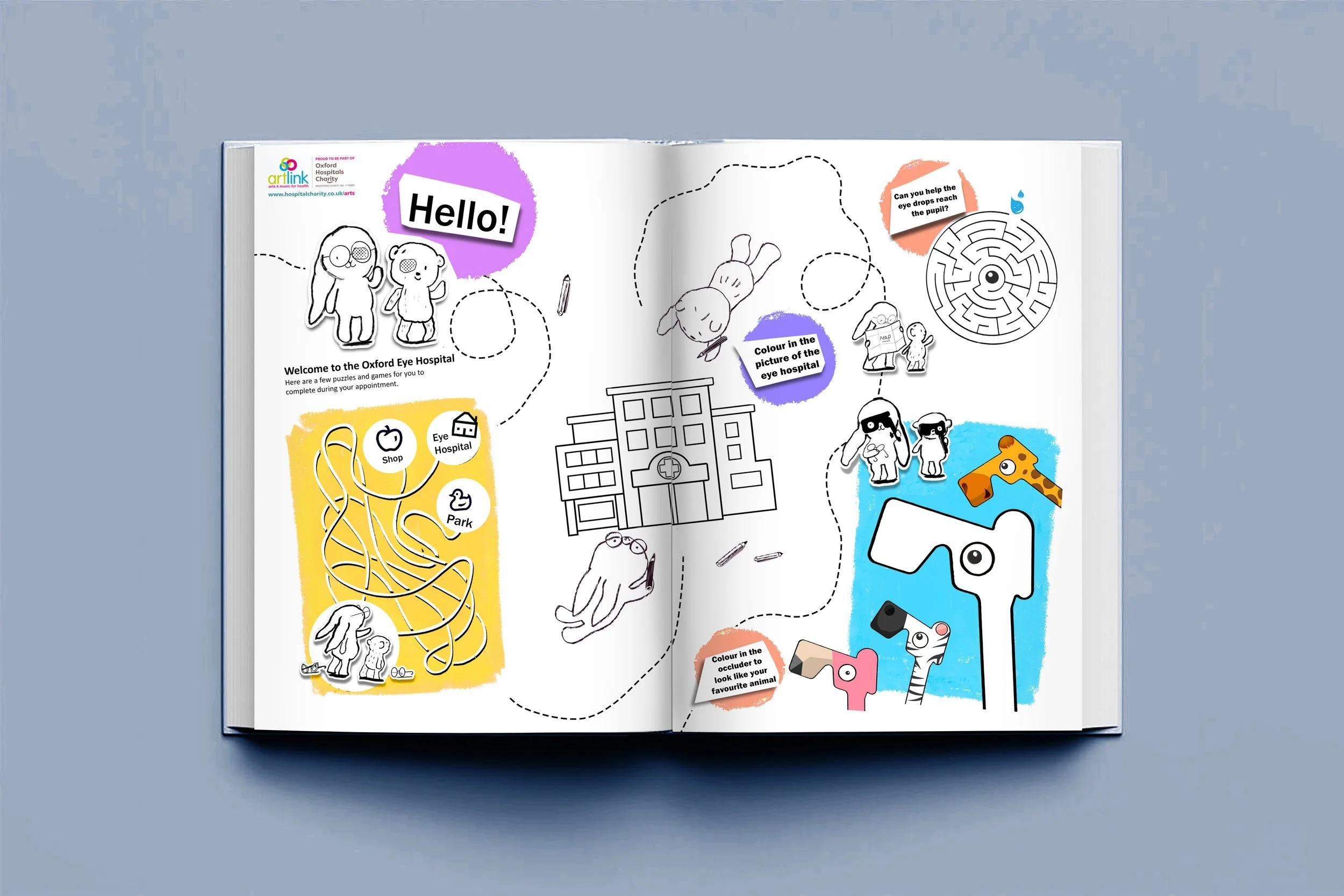
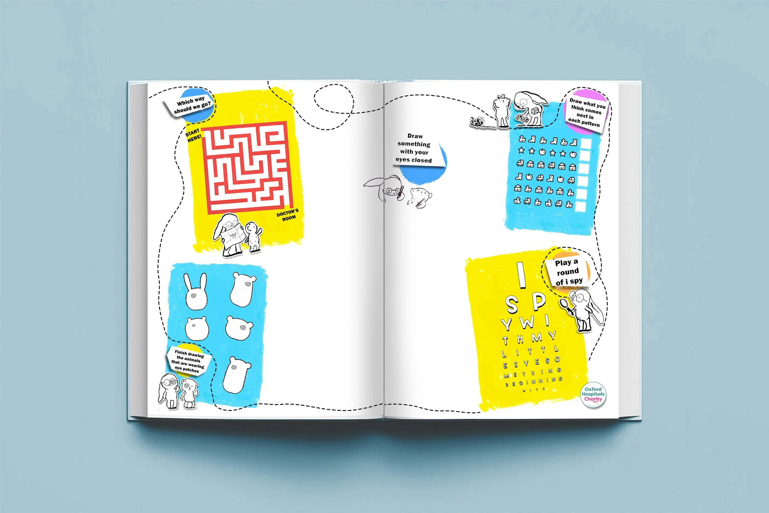
To make the spaces more welcoming for paediatric patients, a series of character illustrations was created by Sarah Lacey and positioned throughout the hospital for children to discover. These illustrations were also adapted into an activity sheet, given to patients on arrival, featuring ophthalmic‑themed games. This added an element of play and discovery, helping to reduce anxiety and improve the overall experience for children and their families. I also felt the the eye hospital didn’t have enough dedicated areas for paediatric patients. I added 3 sets of tables and chairs (these were colour coded for the intended departments - red for eye casualty - yellow for orthoptics and blue for clinic) and was advised by the trusts play specialists on making the areas more patient friendly.

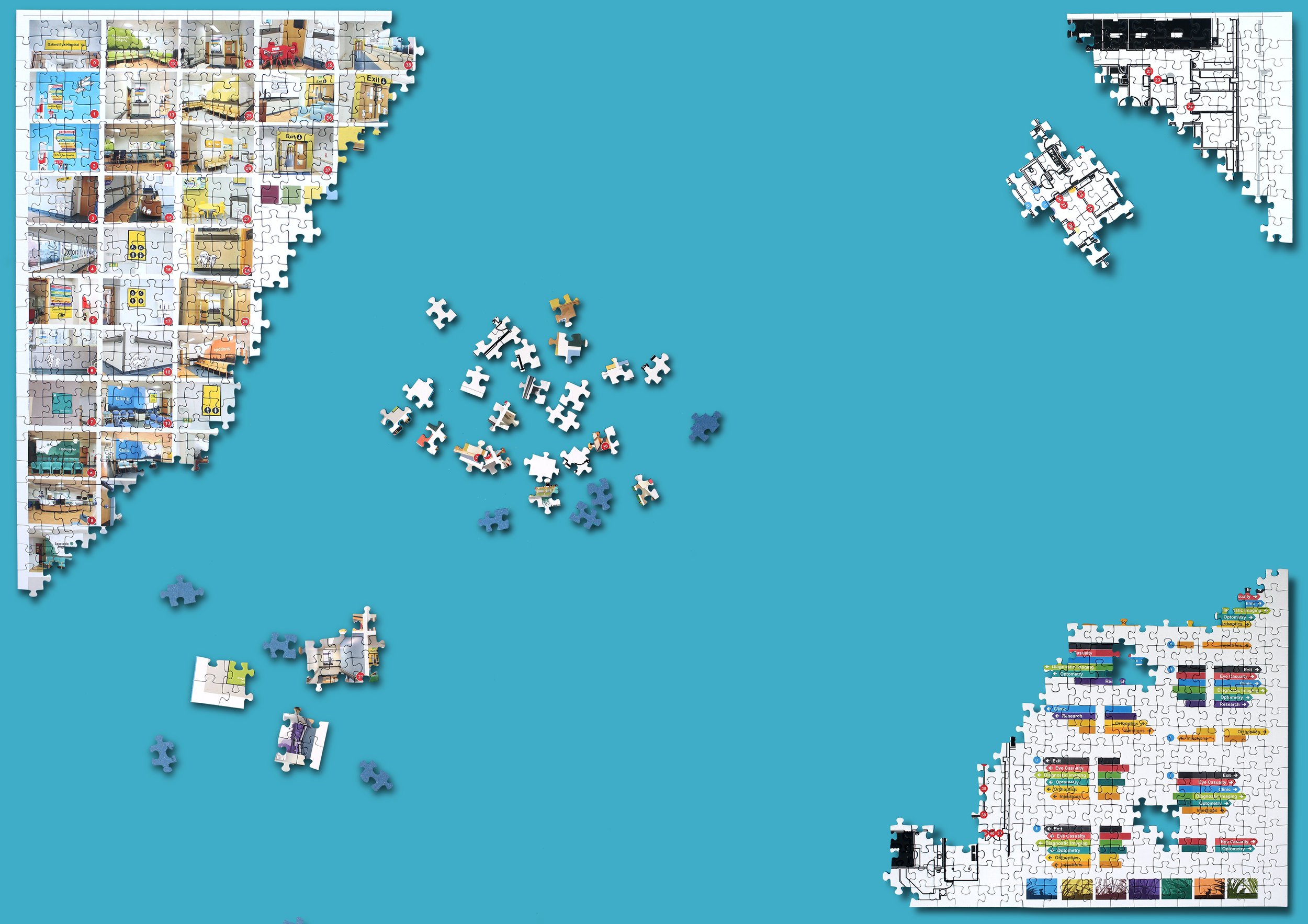
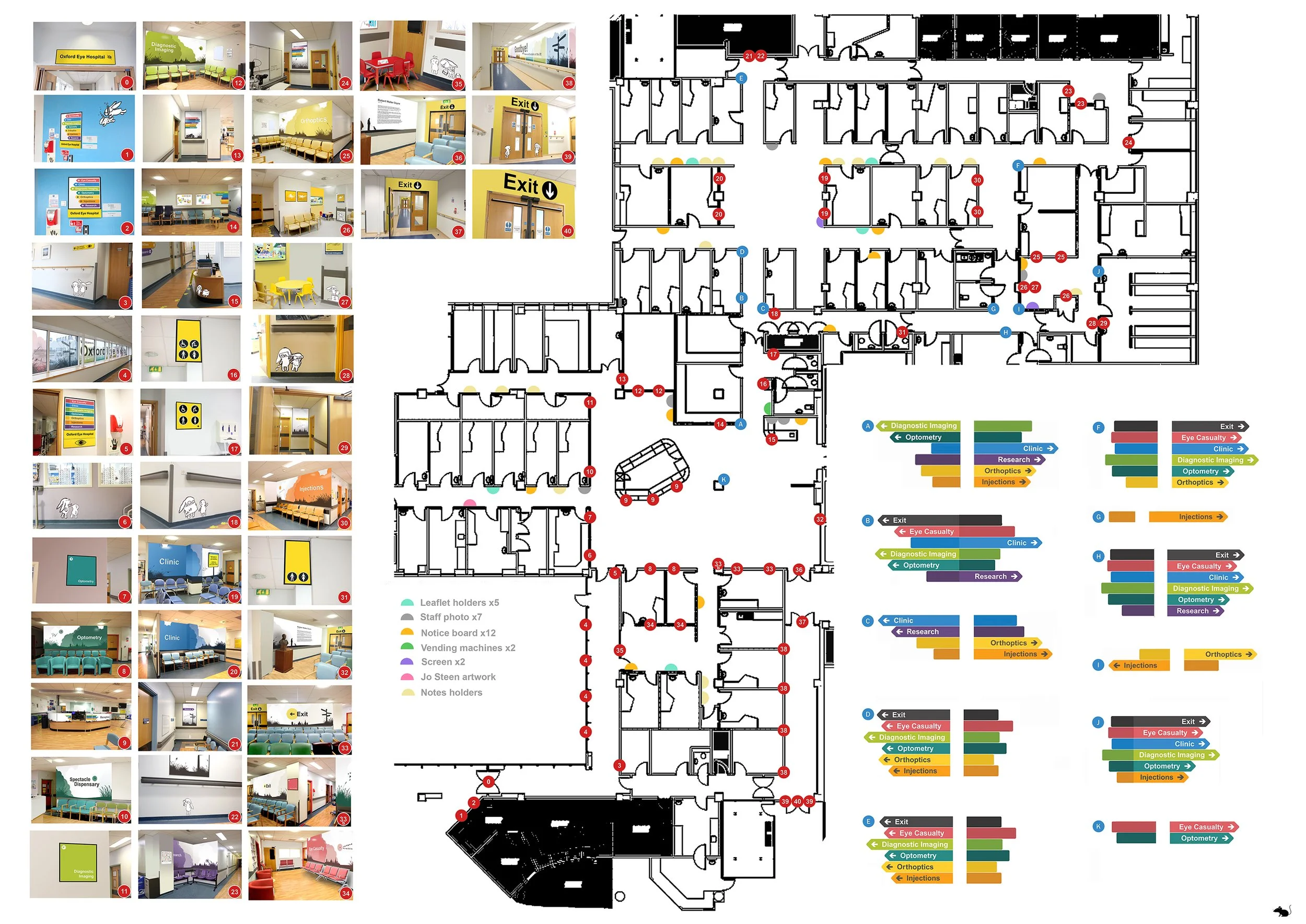
I had all the positioning of where everything needed to go mapped out in my head. From the waiting area artwork to the new position of the vending machines, everything was carefully planned to function and work with each component part.
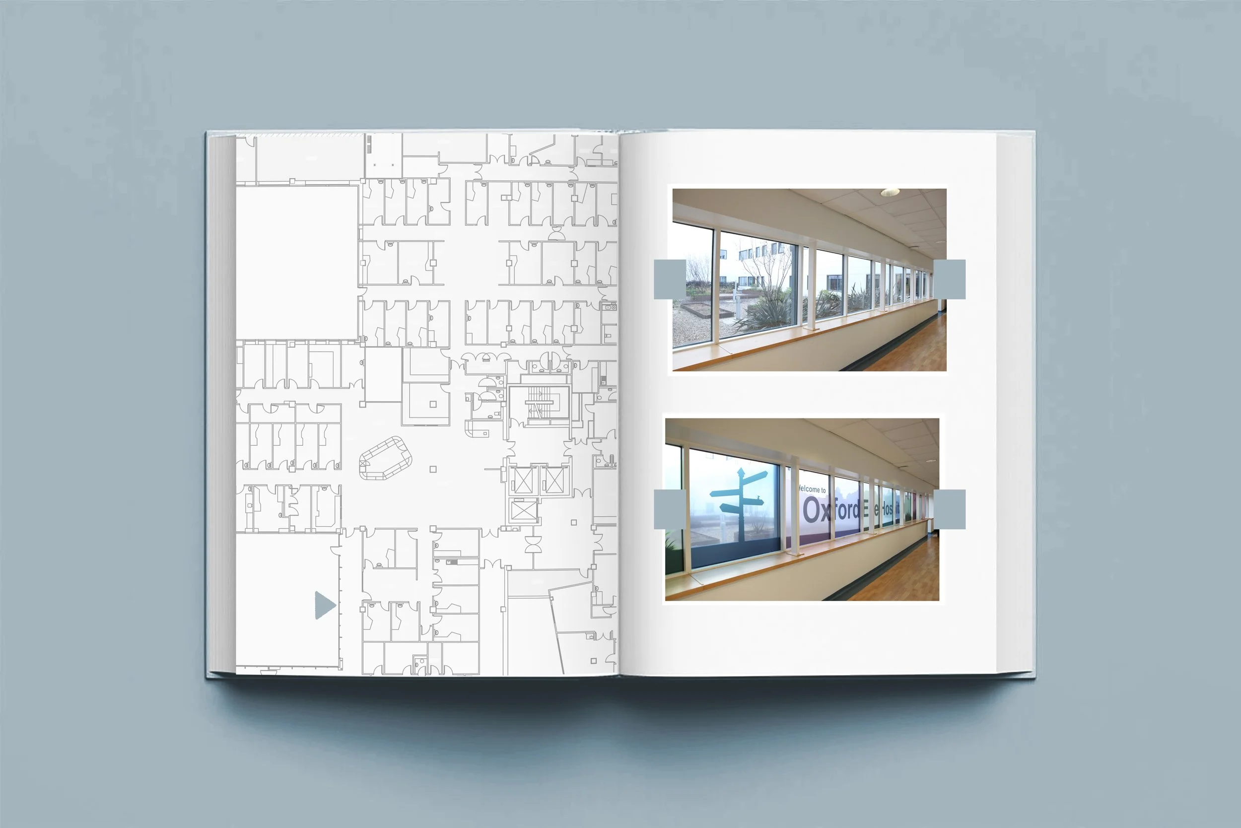
To share my plan with the other departments I produced a master plan to explain how everything fitted together. Using this map to explain was invaluable and really helped in sharing my concept of how to improve the clinical spaces.
The map was printed out on A0 card and was used by the building contractors and vinyl installation team to ensure each part was positioned correctly.
I asked the staff to record any feedback that they have received from patients regarding the improvements to the eye hospital:
Comment received from a visually impaired mother who brings her child with SEND to orthoptics- loved the new signage clear and easy to follow enjoyed sitting at the table with her daughter as she had brought a game to play whilst waiting.
Have had several patients in AMD and optometry clinics say how the new look is very good. Much brighter. Like the new colours. One commented on how the new chairs were better.
One severely visually impaired patient remarked how much calmer she felt as it was easier for her to see where she needed to go. Another was very impressed by the clean look of the department - less visual noise. I followed a toddler to the Orthoptic department who was very excited by the illustrations at her level. A member of the My Vision Staff was very pleased and wondered if we could add some braille plaques for our blind patients
Patient has commented that the Outpatients is now much easier to navigate.
They like how colourful everything is.
Received positive feedback from patient and staff, the hospital looks more organised and easier to access areas.
Patients have commented that the directional arrows reduce stress by making it easy to identify the correct waiting area and the declutter and new artwork creates a calmer environment.
I also asked the staff to share their thoughts :
The improvements are of high quality and well needed. A huge improvement to the feel of the department for staff improving pride in the workplace and morale. The designs are beautiful, very thoughtful and obviously done by a highly skilled artist.
The design is professional but welcoming. It is clean bright and clear. I have long been slightly embarrassed by the look of the department but now feel very proud of the look and how much easier it is for our patients to navigate around. Well done to John, Rebecca and the team for making it happen.
I think this was overdue by a few years and it is extremely helpful to know and direct patients and visitors, this is a job well done. I am also aware of all the thought and consideration that went into this project, and it has been amazing to see this bought to life. I have also noticed patients’ self-directing themselves without asking staff members as it's easier to say and for them to follow the directions - look for the green seating area and wait there.
It improves the general feeling of tidiness and feeling comfortable in a workplace. Less cramped spaces with signs, devices, and posters feel great and subconsciously I believe it will gradually reduce stress and general wellbeing.
It also reduces the amount of time spent on helping patients navigate the department or providing indications as to where to go. The number of queries regarding clinic waiting times has also been reduced.
I think it was a much-needed renovation and has helped with easier navigation for patients. I have found myself not being asked for directions as much by patients. The space looks modernised and more aesthetically pleasing. The colour coding aspect of the signage is an excellent idea for easy navigation. If only this could be rolled out throughout the entire hospital.
It’s such a transformation, the eye hospital is airy, bright and colourful. It’s much easier to direct patients which waiting room to go to next. There seem to be a lot less patients wandering around looking lost. I like that each department has its own colour theme! Lots of patients have been pleasantly surprised by the orthoptic waiting room!
The improvements to the Outpatients area was much needed. Different areas of the OEH is adequately signposted, so giving directions to patients has been much easier. The improved entrance + exit is also a great addition. It is also a good idea to have functioning screens which announces waiting times and notices. It is also a good idea to remove all clutter from walls - staff and teams should do their best to maintain this as it not only looks better and reduces infection risks, it also prevents confusing the patients.
The OEH now looks fantastic with the new improvements in the form of redecoration and the Oxford theme that now currently exists. It looks very professional and like a proper clinical area, unlike the previous drab artwork everywhere that the staff and patients had to endure for years. It is very evident that a lot of hard work has gone into the design and implementation of the new decor, and the improvements are very pleasing to see and very easy on the eye. Jon and his team should be very proud of the work they have achieved and the final result. Thank you very much for all your hard work into the planning!
Video and Poster for European Healthcare Design Conference 2026
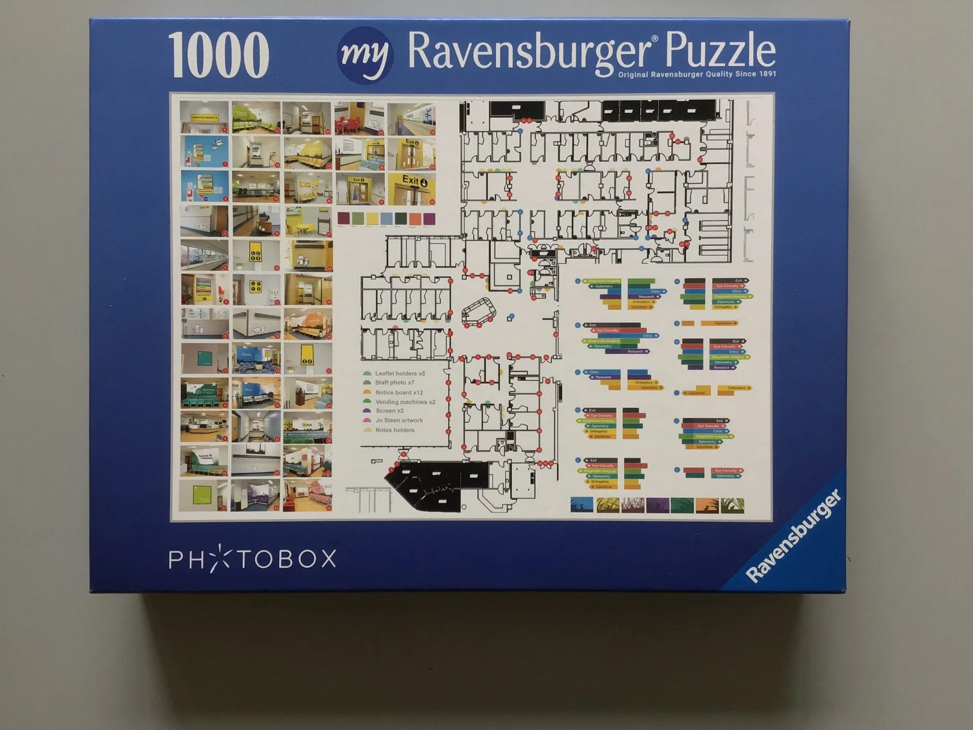
While working on this project it often felt like it was I was working on a giant jigsaw puzzle. Lots of different component pieces that needed to come together to form the final idea. When asked to submit a video and poster for the European Healthcare Design conference based on the improvements to the eye hospital I used a jigsaw puzzle as a metaphor for the final film. It was my intention to produce an unconventional conference film with a narrative which showed how the project came together piece by piece. I submitted two posters - one using a more conventional design and another which was more like a movie poster which gave a limited amount of information but invited the viewer to scan a QR code to find out more. I went with the more standard approach but would have loved to see how the movie poster idea was received.